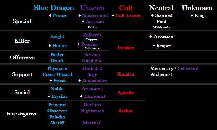
New Class Card Layout

This is a good point, I already know what I would do for it… but I also believe that the Prince should be categorized as “Special” Class.

Cult Leader:

  • Can kill
  • Can Convert people to the Cult
  • Talk to other Cult members

Prince

  • Can kill
  • ONLY Blue Dragon that is Immune to Conversion
  • Can Occupy any class (even classes that are immune to occipying)
  • Talk to his prisoner and interrogate them

The Prince actually seems more “Special” than the Cult Leader.

image

Draft 3.3 - added Special Class type and organized the King around that too

Self critique:
could organize/ label the Wildcards better… but Wildcard isnt a super important thing to know in a Class Card layout anyway.

1 Like

Why are you even doing this anyways?

to make the game easier to teach and to be more understandable at a glance, as apposed to the alphabetical organizing of classes that’s already in place

Why are any of us here anyways?

We’re passionate about the game.

1 Like

This is awesome work. Nicely done, Alkander.

What do the white plus signs mean? Oh, I just realized that means unique.

Can you put a " + = unique" legend in the bottom right corner? I think that is the final touch. I’m not sure there can be any other iteration that is clearer than this.

1 Like

also maybe put something next to paladin/sheriff (in the space normally used by the unseen/cult conversions, respectively) with something to indicate that they’re only in cult/unseen games, respectively
like in the space next to paladin, write in red “only in cult games” or something to that effect, and for sheriff, put a line under Seeker, re-center it, and put “only in unseen games” or something to that effect

Remember. Sage and Herbalist are offensive. Soulcatcher is invest

Even if its difficult to come up with a nicely fitting layout, you have to admit anything that Alkander is suggesting is logically more reasonable than the alphabetical order. Even if types change, knowing what classes BD turns into is important.

I like it.

Even if there are ‘inconsistencies’ it is still much better then the current one.

SUGGESTION TO DEVELOPERS:
If you do not adopt this layout, please make the unseen line up with what they were converted from.

1 Like

image

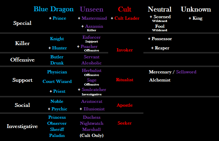
Draft 3.2

Fixed ALL class types

Going to make another version without the class type label, might look cleaner, then Ill make a Poll for it.

1 Like

Paladin has a cult only tag, sheriff doesn’t.

Maybe find a way to show sheriff can’t be converted to seeker?

image

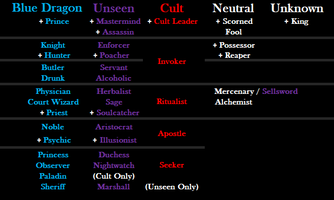
This is a steamlined version that takes out the “Class Type” category. This might be the cleanest way to do it, since they have recently added the picture on the side that shows the class/ converted class/ and type.
So this might be the way to go.

1 Like

Enforcer is Offensive psure

yes, but why does it matter? his latest version doesn’t show class type

I just realized that if they use this then they could put the Picture in the bottom right where nothing already is

1 Like

Boslof has already fixed the prominent issues. When you hover over a class in-game now, it shows class type and Unseen conversion.

This one still is still better for at a glance info and it shows how the game is structured better. Plus they are mutually exclusive

If I showed this to someone who’s never played the game before… The only thing they’d get from it is that some classes have different colors, and also that some classes have plus signs for some weird reason?

And that Cult only in Unseen, and Unseen only in Cult???

AND that Sellsword might fall under unknown.

And they might be able to guess what some classes do from their name alone but not really?

Not really the optimal way of doing it no…

Hmm, I see what you mean.

Maybe put a small white arrow inbetween the BD and Unseen classes to clarify the fact that Unseen classes come from those converted BD classes.