 We believe a solid foundation is important to build upon. This patch offers:
- Lower learning curve for new and returning players
- Less bloaty text for everyone, when hopping through class cards, glossary, or guide texts trying to find “that one thing”.
- Significantly-more accurate and less-confusing class cards, tips, glossary, guide, etc.
- Legibility of text (since it’s a text game!) with less “weight” and less homework to learn things.
- Quality of life: Things can get overwhelming fast – now, less so.
Class Fixes
- Fixed nearly every reported inaccuracy within class cards (too many to list).
- Chronomancer’s Distort Reality abil feedback text to the victim no longer shows the incorrect text in green, as if it was a good thing happening you.
Bug Fixes
- Fixed specific win conditions for quests.
- Suspended players will no longer get stuck at the login screen (and stuck “Loading…” from news): They should now properly see the popup and an explanation in the news area.
QoL
- Clicking on an underlined link now has an animated arrow guide you to the exact term you are looking for:
- Streamlined numerous class cards, abilities and tips to get the point across with shorter, to-the-point descriptions. In addition, wording should now feel more-similar and streamlined. There may be some new “info passives” that simply explain deeper mechanics better.
- Changed all class card tips to be short bullet points.
- Fixed class card glossary/class links - they should all be clickable and accuracy, now.
- Tutorial now initially hides most the UI, then slowly introduces elements.
- Some UI elements are now draggable, where you shouldn’t be able to “lose” them off the screen:
- Glossary links now work (to other parts of the glossary, or class cards).
- Glossary/class card links are now clickable from the rotating tips.
- Updated and streamlined glossary to have less text and be more-legible.
- Also added new clickable terms (that interact via clicks from other places, such as class cards), such as Poison, Intensify and several player-meta terms.
- Updated the Guide, similarly to above.
- Clickable neutral class links are sometimes bolded when seen with other white text. If you see other areas that have a good fit for this, treat it like a bug and toss it into Discord #bug-report (thanks!).
- Faction colors are now more-legible, dynamically changing based on the background: They are now brighter or darker, depending on what is more-legible to read. This should take effect throughout the game: Please report inconsistencies.
- All in-game class card links should now work — and added a few more acronyms for classes.
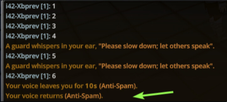
- Fixed in-game, automated mute system to be less confusing and more-informative; additionally, it now alerts you how long you’ll be [temporarily] muted for and when the mute lifts (almost ported to lobby, too, but delayed due to hackers):
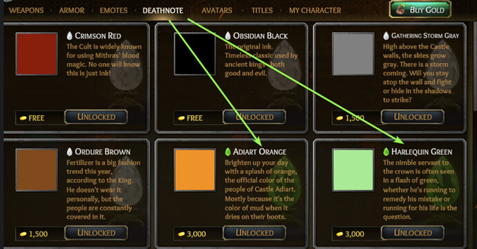
- Deathnote colors in the store no longer show a tier color, to prevent confusion:
We thought we may as well toss you what we were working on before moving to anti-hack (next patch) 
–Xblade @ https://discord.gg/tol


