General Forum Maintenance: Complete

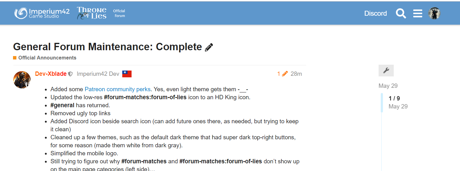
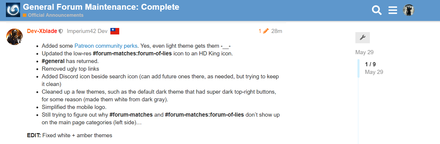
  • Added some Patreon community perks. Yes, even light theme gets them -__-
  • Updated the low-res #forum-matches:forum-of-lies icon to an HD King icon.
  • #general has returned.
  • Removed ugly top links
  • Added Discord icon beside search icon (can add future ones there, as needed, but trying to keep it clean)
  • Cleaned up a few themes, such as the default dark theme that had super dark top-right buttons, for some reason (made them white from dark gray).
  • Simplified the mobile logo.
  • Still trying to figure out why #forum-matches and #forum-matches:forum-of-lies don’t show up on the main page categories (left side)…

EDIT 1:

  • Fixed white + amber themes

EDIT 2:

  • Changed the scrolling logo to a transparent one.
  • Ensured Discord icon didn’t disappear when scrolling down.
  • Take 2 on the updated logo (desktop+mobile).
1 Like

They don’t? I have them.
image

2 Likes

…what?? lol. I don’t!!

Go back

Go back

Trust me go back

Yeah no it’s just you

Just changed it to Throne - removed the forum part. Just for mobile.

This now dissapears for me when I’m not at the top of the page (on light theme). I can imagine that’s not intended?

Light theme, best theme. :upside_down_face:

1 Like

If you scroll up just a little, it comes back. I think it’s always done this to expose the full name of the thread on the small mobile screen. If it’s exclusive to white theme or you’re 100 percent sure this didn’t do it before, let me know and I’ll investigate.

1 2

This is what happens when scrolling down on desktop. I’d imagine you’d want to keep the Discord link, which I can imagine to be a different view, when scrolling down?

It’s just applicable to the new Discord link you added and it’s not a huge deal by any means, but I thought I’d bring it up.

I can see that on Mobile it works very differently and looks a lot smoother. (close to full desktop user. :stuck_out_tongue_winking_eye: )

2 Likes

Oh on desktop! Totally shouldn’t do that. I’ll fix that tomorrow :slight_smile:

1 Like

This is even worse aaaaaaaaa

Mostly because it should honestly have either “Throne of Lies” or “Imperium 42” instead of just “Throne”

Largely because if you do want a short one (the old was never too big anyways but okay) it should just be ì42

Especially because the “Throne” isn’t even centered and it hurts :cry:

I do have that link too

Why was general removed?

Mobile version should have “TOL” Instead of “Throne” imo.

Ă­42, you heathen.

Haven’t seen it in a while, whatever

You have been cursed with bad luck for the next 10
minutes.

Honestly agree.
I believe it’s better off with the more intricate one.
It looks extremely unprofessional on mobile now.