Class Card Screen
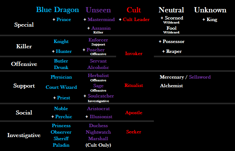
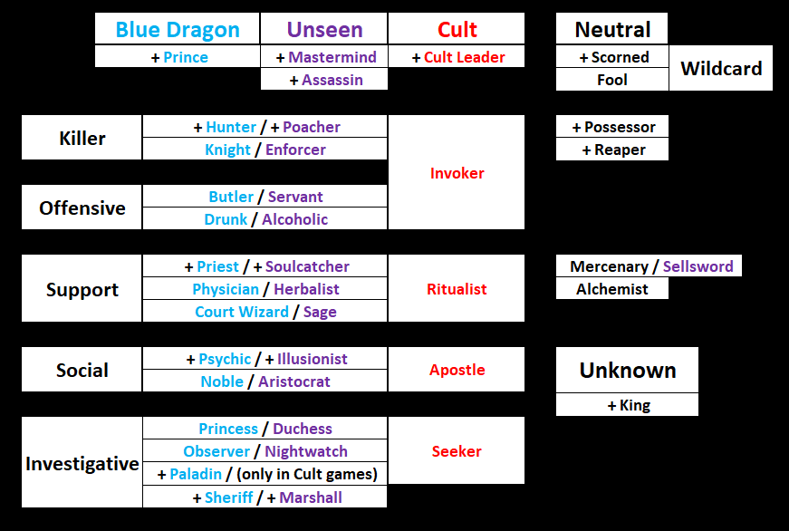
This is my redesign of the Class Card Menu. In its current state, the classes being sorted alphabetically adds absolutely nothing to the clarity and concept of the game.
Example
If I am ever explaining a game to someone I usually first set up the pieces/ cards/ etc in a grouping that helps them categorize what I’m about to tell them. The separation of each faction is nice… but alphabetization is not helpful
Visual Structure
If you structure it in this way it makes sense just looking at a glance. New players will understand how things are organized and certain classes turn into others (even with cult). Mercenary turning into a Sellsword is very intuitive when set up this way. I am a Teacher for my profession and I color code things all the time.
Benefits:
- The “leaders” of each faction are separated away from the others (as they should be) since they are so important/ distinct to the faction as a whole.
- Sorting the main chunk of classes by their type helps people see the groupings AND see how each type converts into a specific type of cult class.
- Converted classes are easily seen at a glance, without having to be inside one of the class cards to see what it converts to.
- Mercenary converting to Sellsword is obvious this way… AND lets everyone know it is also the only neutral that can be converted.
This image can teach people the game just by seeing the structure. I am very familiar with this game and play it every day, while making this I even made some connections about certain things after seeing it like this.

So this is my first draft of it, let me know what you think!
Side note:
Whenever someone clicks on the “Classes” button at the top of the screen, they should be taken to the actual class layout… NOT to the specific Kings Class Card. I dont know why it is like this. When you are in game and are already a specific class, then yes it should pop up as what you are. But if you are in the lobby, it should take you to the overall picture.

